So what is responsive web design?
Responsive web design or RWD is a practice of building website that work perfectly on all devices and any screen resolutions. So how responsive web design is done? The RWD combines three major components.
Flexible Layout
We no longer depend on pixels and inches. In RWD everything works on percentage or em units. Flexible layout means designing the website layout with flexible grids, which are built using percentage or em units that are capable of dynamically resizing to any width. Our responsive web design company makes sure that your web site runs smoothly in every possible platform. Flexible layout of the responsive website doesn't recommend the usage of fixed values because the view-port height and width changes from device to device.
Media Queries
Sometimes the width of the browser viewport becomes very small that even scaling the layout proportionally will create columns which are too small to effectively display the content. In this situation media queries can help us to build better experiences. Media queries are the latest technology in CSS3, which makes it possible to apply a CSS only to a specific screen size. Say if you wish to have a different background for your website's tablet users, you can do so with the help of media queries.
Flexible Media
A layout is not flexible if some of the elements are fixed. A flexible layout allows the columns and grids to be fluid. But what about the media, images and videos?
To achieve responsive images we replace the fixed measurements such as pixels and inches with percentage. The images are made relative to its parent container using ‘max-width’ property so that it adjusts according to the container's percentage width. This is applicable only for inline images and the CSS3 has introduced a new property called background-size for background images.
Why go for responsive web design?
The internet is growing like crazy. The growth of mobile internet usage is also high compared to general internet usage. It is difficult these days to find someone who doesn't own a mobile device. In this situation there arises a question on how to build a website that is suitable for all users. The IT world response to this has become responsive web design.

Jquery
Jquery is one of the best tool to create a responsive web design of any website. This tool helps in providing a chance for the web designers to play with the plugins that can help in increasing the adaptability and the responsiveness of the overall website design. Supersized, FitText, Elastislide and FitVids are some of the popular plugins of Jquery that can be used to create a responsive web design. Our responsive web design company uses the Jquery to make sure that your website fluidly run on all platforms.

Page loading speed
Something which is quite important due to its impact on all the other contents on the website. Web designers are always on the lookout for improving the load speed of every page, every time they design a website. Our designers avoid using large images that are too large and might prevent the site from loading quick. This will annoy the visitors who have neither the patience nor the time to wait till the page loads. So, when it comes to responsive design we repeat the same rule all over again. But, with responsive designs it is not possible to say that we can expect enhanced loading speeds. Studies reveal that around 48% of the responsive sites take 4 to 8 seconds to load. What could be the possible reason that is pulling back your site’s responsiveness? Non-optimized images. There could be no other reason that is preventing your site from loading quick. Minimize the usage of these non-optimized images. Remember your goal is to make your site as responsive as possible. Our best responsive web design company is well known for our ability to design responsive web sites.

Adaptive Web Design
Not to confused with responsiveness, where the page or service is tested across different platforms and devices. Adaptive web designing is a technique of designing a web outlet with responsiveness issue in mind from the beginning. This technique helps in designs adapt to the client’s needs and capabilities. Adaptive web designing also allows the designers to create multiple versions of a web page so as to it is better suited to many different devices and platforms.
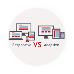
Responsive vs. Adaptive
Responsive design and adaptive web design are quite similar, and sometimes confused to be the same technique. Responsive design is about having quick loading time across different bandwidth speeds and the transition speeds from pages to pages. While adaptive design is about maintaining the aesthetics of designs across different outlets resolutions. Both responsive and adaptive web designs should be done culminating together to bring designs to lively and adaptive. The combination of the two is needed for the ideal form and functionality of a web site.